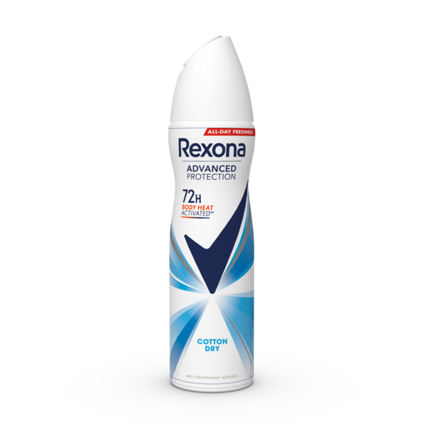
Preserving brand identity – distortion-free product packaging
Ensuring Unilever's brand identity is consistent through
pre-distortioned manner.

BIO pasta sustainably packaged – transition from plastic to recycled paper.
Our task was to support our client Zabler in transitioning from plastic packaging to sustainable
paper while maintaining the attractiveness and quality of the product.
Originally planned to be printed using the rotogravure process, the newly chosen paper was not compatible due to its lack of colour intensity. Additionally, since paper is not transparent, an alternative concept had to be developed to replace the viewing window while maintaining an appealing product presentation.
Comprehensive graphic revision was carried out for flexographic printing. Colour chart creation for brand colours and backgrounds, fingerprinting, and resulting colour profiles for further reproduction. This meticulous process ensured that proofs achieved the desired results, which was particularly essential for the simultaneous visual integration of the client' s 14 pasta varieties. By capturing product images in-house and seamlessly integrating them into the customised design, the previous viewing window could be replaced. The products were realistically showcased through the consistent colour management workflow.
All in one! Product shooting, design adaptation, reproduction, and expert guidance throughout the entire production printing process enabled Zabler to successfully and seamlessly transition to sustainable packaging. This packaging impresses customers with an environmentally conscious and attractive product presentation at the point of sale, highlighting the quality of the BIO pasta.