PRODUCT PHOTOGRAPHY AND STYLING –
go hand in hand for a perfect look.
A flawless figure and an immaculate appearance – every model needs to look perfect in front of the camera. And product photography is no different. To make food look enticing on packaging or in advertising brochures, food stylists use clever tricks to whet our appetites.
Perfect product photos are created by stylists who also know about photography or who are experts in both fields. How does the manufacturer envisage the product? What colours and lighting do they want? What message should the image ultimately convey? Depending on the client’s wishes, the stylists position the product, set up the lighting and select the shutter speed to obtain the right effect.
COLOR MANAGEMENT
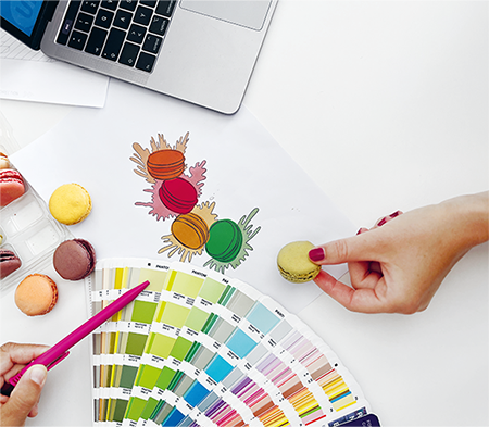
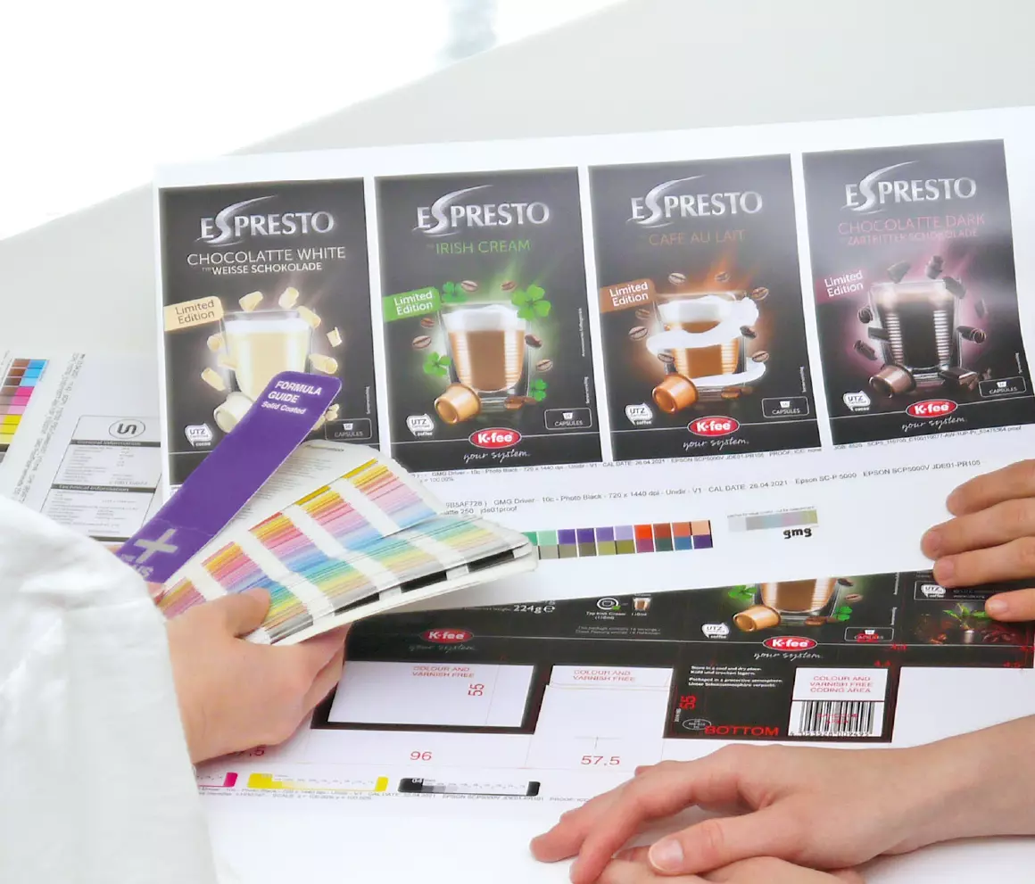
Are the colours right? Whether during the early stages of the design or later on, colour is the name of the game in packaging design.

Studies have shown that three out of four consumers regularly claim that colours essentially influence their purchase decision. Nevertheless, colours are no longer just a visual effect. Today, they are defined, measurable values. According to research conducted by Loyola University Maryland, exact reproduction of the colour palette increases the recognisability of a brand by 80 per cent.
IN THE LIMELIGHT

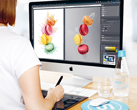
Ideas and creativity are needed to show what the product can do. Alongside their pastel colours, macarons are known primarily for their airy lightness. To capture their weightlessness in the photo, the food stylist places the individual biscuits on transparent stands. The graphic designer then arranges the macarons to fit the desired picture composition and make them float. Additional design features enhance the effect to show them at their best.
Packaging needs to live up to what the brand promises. Many factors are involved in ensuring that the design, layout and colour always produce a consistent brand image – the printing substrate being just one. Linked2Brands starts by using its know-how and expertise to create an appealing image of the product. The second task is then to ensure that the image slots seamlessly into the overall design so that the brand is reflected in every package and at every point of sale.


