ARTWORK ON AUTOPILOT – smart evolution of packaging data production
Limited editions, seasonal varieties, expanded product lines – customers like to ring the changes. To ensure they don’t satisfy their thirst for novelty elsewhere, astute brand manufacturers will do well to retain customer loyalty with original and creative ideas. What is more, this form of product differentiation gives companies an opportunity to test the waters. Product variations are therefore a useful tool in many respects, but only if they are presented to the customers in the right way.
First and foremost, packaging is the key to getting a product noticed and arousing curiosity. It needs to feel good, promise quality and match the brand. A lot of time, design acumen and meticulous artwork go into every detail of the brand identity: the logo, the colours, the graphic elements, the typography and the proportions.
Taken together, these ensure that customers immediately associate a product with a certain brand. If small runs of a brand product, like limited editions and seasonal varieties, are to have the desired effect, i.e. contribute to brand awareness, it is important to put the same effort into them. “Even straying slightly from the norm can backfire and will not pay off in the long run,” says Markus Fautz, Managing Director at Linked2Brands Germany. “If you want packaging to instantly show customers that the brand keeps its promises, even in special campaigns like limited editions, it needs to have the familiar look and feel at the point of sale – no matter whether it’s on a shop shelf or sold through eCommerce.
“ If all these aspects – from design and artwork to production – slot together smoothly, brand owners can be sure that all the elements and information that make up the brand are visible on the packaging according to the brand book or the style guide. Know-how and a sure instinct are the name of the game here, as is a meticulous approach throughout the design-to-print-process.
Brands make promises about their whole product range and the packaging design needs to back them up. This is precisely where the brand guardians at Linked2Brands come in. They ensure that the design, layout and colour result in aconsistent brand image – globally via all channels. And that is precisely what brought K-fee to Linked2Brands.
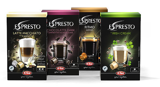
In an exclusive, patented system of machines and capsules, K-fee offers a wide variety of beverages of the kind served in cafés: from espresso and teas to milk drinks. K-fee was planning for the first time to sell limited editions to expand the product range by limited editions for its home brand Espresto with four “in” flavours and was looking for just the right packaging design.
To find it, K-fee took a more liberal approach to the style guide, which allowed the designers greater freedom to develop a slightly unusual variation. The packaging was to have a clear emphasis on emotion as well as limited availability. K-fee initially planned a run of 3,000 units for this limited edition. While the packaging for the standard products was to be manufactured using offset printing and high-quality finishing, such as silver foil, embossing and UV lacquer, the packaging for the new varieties would be produced for the first time using digital printing, to be able to sell small quantities.
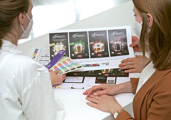
Linked2Brands has over twenty-five years of experience and sound knowledge in the area of brand presentation. From the very beginning of a project, the specialists keep an eye on the implementation of the design in the different printing processes. From the design through to the proofs, with all the different design revisions, artwork and repro that come in between, they check all relevant parameters to ensure the brand identity is reproduced reliably and coherently with a specific printing method.
When it came to the limited edition, the Linked2Brands team had to consider one crucial factor: recreating the high-quality appearance of the packaging with digital printing. This is no easy task as the digital process needs to simulate refinements so that the design, layout and colour that customers are familiar with from the core products look the same. The final results depend on a wide range of factors and more than a little experience. What advantages or limitations does the printing technique bring with it? How can effects be reproduced in the best possible way?
“One big reason why our limited edition is spot on is because one and the same person is responsible for all production steps at Linked2Brands. As a result, even the smallest pieces of information flow seamlessly and nothing gets lost on the way. The results meet our quality standards in terms both of design and realisation,” says a pleased Jana Krüger, Product Manager at K-fee.
Linked2Brands knows that myriad design details are crucial if you want to ensure a consistent brand appearance. And so for that exact reason, the production agency acts as a one-stop shop using clear communication and close consultation to organise the interaction of everyone involved.
Thanks to this closely attuned method of working, processes flow flexibly into one another and produce compelling results. For customers, this shortens the time to market and saves money. “The first edition has already sold out completely,” Krüger reports. “The feedback from customers was very good so we have already produced another run. We are currently considering whether to add some of these flavours to our core range.”
The collaboration is entering the next round for the brand-specialists at Linked2Brands with translation services for other language variants of their products. Furthermore (we can safely share this with you), following the resounding success, customers can look forward to more limited editions from K-fee.

Dominic Lampert
Head of Technology & Applications
Linked2Brands Germany
Mattweg 1
77971 Kippenheim
We're always happy to hear from our customers and visitors! Please use the form below to get in touch with us.