ARTWORK ON AUTOPILOT – smart evolution of packaging data production
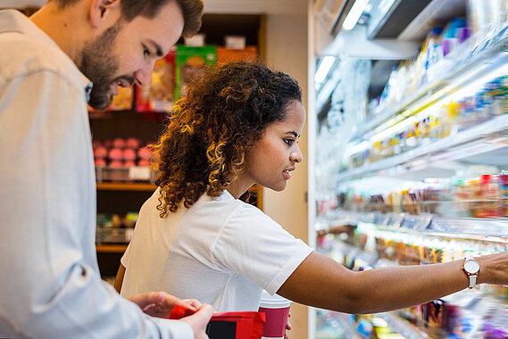
Companies often put a great deal of effort into looking after their brands and invest large sums of money in brand communication. As many as 75 per cent of consumers don't decide what they are going to buy until they are standing in front of the display, so this is the point when their favourite brands should be instantly recognisable.
If we consumers were rational creatures, we would research all the facts about the crisps market on the spot and weigh up our purchase decision down to the last detail. Is the price fair, do the crisps taste good, which kind has the nicest
crunch when we bite into it? Is the cheese flavouring on the delicate slices of potato actually cheddar and, while we are at it, did the potatoes really have a happy life? It would take hours. It doesn’t end there either: we will need to get in more than just crisps when we invite our friends round. There’s beer and biscuits, plus pickles, tomatoes and butter for the sandwiches still to be made. This kind of shopping trip would drive us nuts if we were truly rational. After all, a large supermarket may sell more than 30,000 different products. We would have to plan months in advance just for one evening. Thankfully brands make things a little easier. For example, if a familiar brand of crisps appeals because the slices of potato are so beautifully thinly sliced yet tasty nonetheless, having been fried to perfect crispness in sunflower oil and then nicely seasoned, or if that is at least what is claimed in an advert, then we will grab them without more ado. The same goes for brands like Landliebe butter, Géramont cheese, Bahlsen biscuits or Amora Maille mustard. We decide in a split second and, hey presto, the shopping is done and we have more time to spend with our friends.
There is a catch though: the brand in our heads is not necessarily the same as the brand in the shop. The product on offer has to stand out, arouse our curiosity, feel good and, of course, have been sustainably produced. Above all, though, it also has to fit with the brand, make it an experience, and an unmistakable one at that. This will depend primarily on the packaging. Staying with the example of snacks: when we stand in front of a selection of crisps, peanut fl ips or twiglets, the bag should tell us whether it keeps the brand promise. This is where experts who watch over the brand come in.
Of course, the whole process is intuitive. Nobody actually realises that a specific brand is so popular because clever presentation associates it with fun and leisure time. Each of us has a certain image of a brand in our mind. How that can be reflected in the packaging, at the point of sale, either on a shelf or in eCommerce, is an art that few have mastered as well as Linked2Brands. Their one hundred or so staff, who came from the former Janoschka brand unit, have it down to a T. They have honed communication between brand customers and consumers into a fine art, skilfully combining a brand mind-set with production expertise.
Studies by the market research company Growth from Knowledge (GfK) suggest that up to 75 per cent of all purchase decisions are made in the shop. Furthermore, it has been claimed that people subconsciously form an idea of the things around them in seconds – that does not leave much time to reflect.
It is the design details and, above all, the colours that are decisive. Do the proportions, layout and text blocks on the packaging look right? And what about the fonts, graphic elements and images? Not to mention the logo – does it refl ect the brand personality?
Does, for example, the overall appearance support the claim of being a premium brand? Or, has a trainee at a new advertising agency ignored brand guidelines by quickly shifting the brand logo to the edge of the packaging to make way for a spontaneous special offer? This misdemeanour will damage the brand and will fail to pay off despite the promotion – at least in the long run.
Getting the colours right is even more important. Studies have shown that this is the main factor. Three out of four consumers regularly say that colours have a key influence on their purchase decisions. Nevertheless, colours are no longer just a visual effect. Today, they are measurable, defined values. The exact reproduction of the colour palette boosts brand recognition by 80 per cent according to research at Loyola University Maryland. "Brands make a promise that the packaging also has to live up to," says Stefan Hilss, Managing Director of Linked2Brands. His agency ensures precisely that: the design, layout and colour have to create a consistent brand image – across the world and through all channels.
This is not at all easy: product ranges vary from country to country as do the legal requirements about what has to be written on the packaging whether with respect to contents, customer protection information or origin. For example, EU directives differ from those in countries on the other side of the globe.
Furthermore, colour is not just colour. The end result depends on a range of factors. Firstly, the material that it is printed onto, what we call the substrate. Has it been manufactured using recycled cardboard, white paper, film or aluminium? The colours used, printing tools, equipment and methods are further factors – up to seventy variables make a difference. Finally, we also have to bear in mind the platform where the product packaging will appear, i.e. printed on the shelf or the Internet.
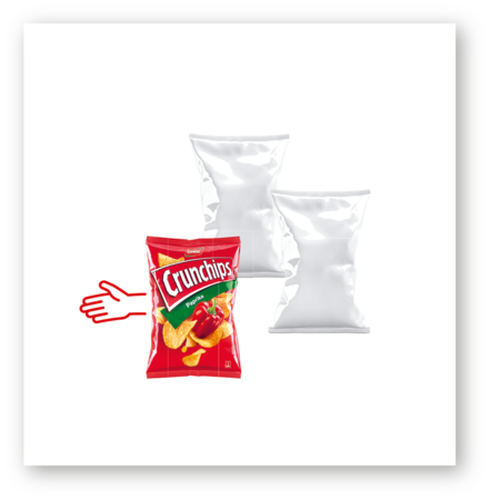
The manufacturers have defined the ideal for themselves. If the familiar colour of a brand of crisps appears faded, the consumer may well recognise the crisps, but might also think that the bag has been lying on the shelf for quite a while. They will doubt the quality of the contents, potentially undermining the entire brand.
It is, however, virtually impossible always to achieve the ideal. The basic parameters vary too much (the substrate being the key here). Nevertheless, if we want a product and the brand to appear as consistent as possible even if compromises do have to be made, they should at least be consciously
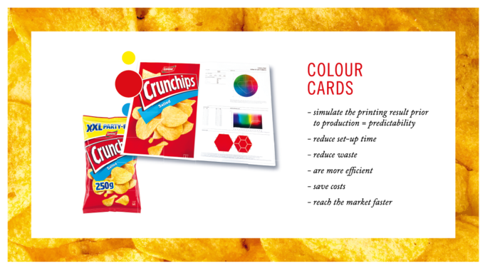
weighed up and always go in the same direction. Linked2Brands has devised so-called colour cards for this purpose that predict the appearance on a certain substrate with a specific printing method. Linked2Brands starts out by analysing the portfolio: the number of substrates, the printing method, the colours and elements that should be constant. They cluster these and decide how closely each of the different scenarios should be managed. The results are applied in the subsequently printed colour cards. They show the spectrum of colour deviations that are acceptable and thus set the standard. Customers will then know what to expect. Since Linked2Brands likes to work with brand owners through all stages of packaging production, they provide in depth consulting services before starting the analysis. They promise customers that this will save more time and money because this method defi nes the goals before printing starts.
But here, too, absolute perfectionism would be out of place: "You could go on and on defining the colour scale until it drove you mad," says Linked2Brands Managing Director Stefan Hilss. The brand experts at Linked2Brands usually concentrate on two, three or four versions to be cost-effective. This approach enables clients and printing partners to see the benchmark that has been set. Once everything works, the separate file together with a true colour proof and the colour card is sent to the printer, which is ideally equipped with Janoschka printing tools. All this will also make life easier next time we want to watch the football with our friends: nothing will stand in the way of quickly grabbing a bag of crisps off the shelf.

Dominic Lampert
Head of Technology & Applications
Linked2Brands Germany
Mattweg 1
77971 Kippenheim
We're always happy to hear from our customers and visitors! Please use the form below to get in touch with us.